As CPAs, we pay attention to economic trends because those have big impact on our client’s operations. Understanding what is happening in terms of interest rates, growth or shrinkage in the GDP, unemployment trends, and real estate prices also helps us interpret financial statements during and audit or review.
It is time to start monitoring inflation rates.
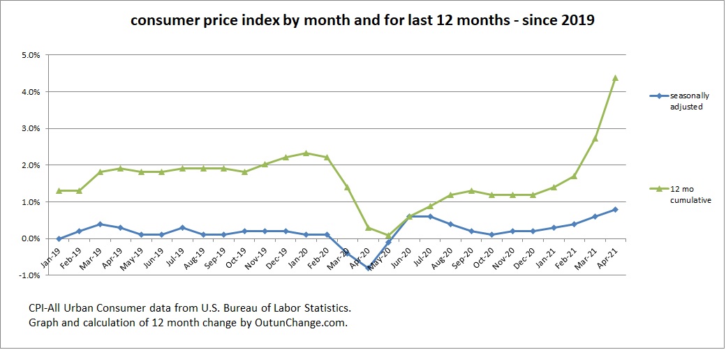
Graph at the top of this post shows worrying information about inflation.
The inflation rate has been increasing for the last six months. In March 2021 the CPI-All Urban Consumer index increased to 0.6%. In April 2021 and went up a distressing.8%. That is 1.4% in two months. For comparison the overall trend for the last several years been around 2% for a year.
The increase in prices or preceding 12 months had been running at essentially 2% for 2019. A major drop in prices of 0.4% in March 2020 and 0.8% in April 2020 cause the 12 month cumulative rate to drop into the 0% to 1% range for most of 2020.
With dropping the March and April 2020 numbers out of the 12 month calculation and replacing those with accelerating inflation in the last several months, the one year rate was 2.73% in 3/21 and 4.3% in 4/21.
Those are rather unsettling numbers.
We need to start paying attention to inflation numbers and articles trying to give some context to the increases.
This post will give a couple more graphs for more background. Next post will describe several articles I’ve read in the last few weeks.
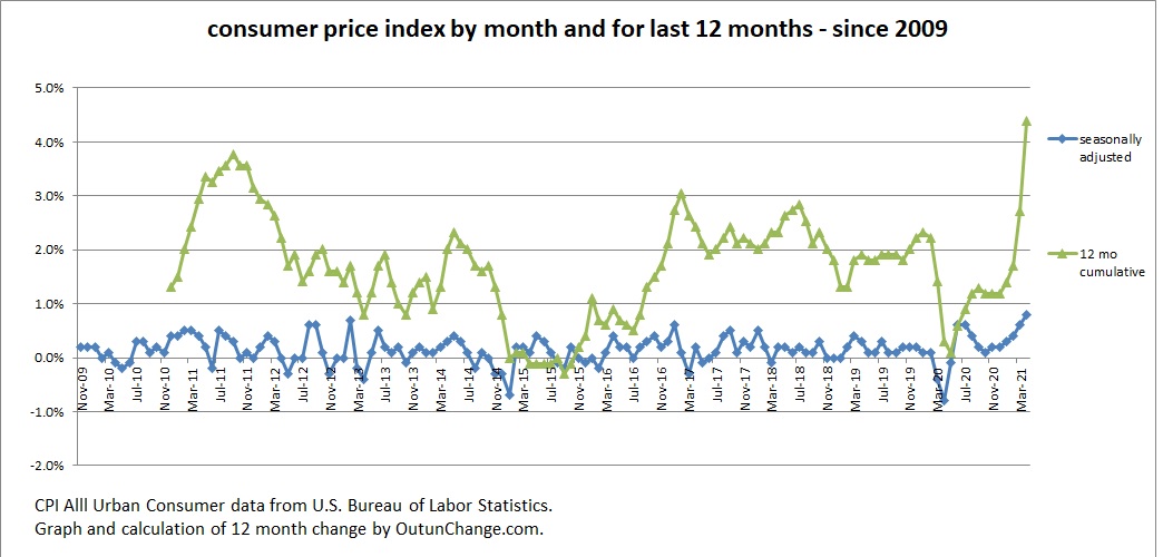
Let’s look at a longer time horizon for the monthly changes in the compound 12 month change.
I have a tracking the inflation statistics among other data, for quite some time. Here is the monthly change in the basic indicator since 2019. I also calculated the 12 month compounded change. If you kinda, sorta mentally draw a smooth the line that shows inflation at somewhere around the 2% mark or slightly lower for 2009 through the start of the pandemic.
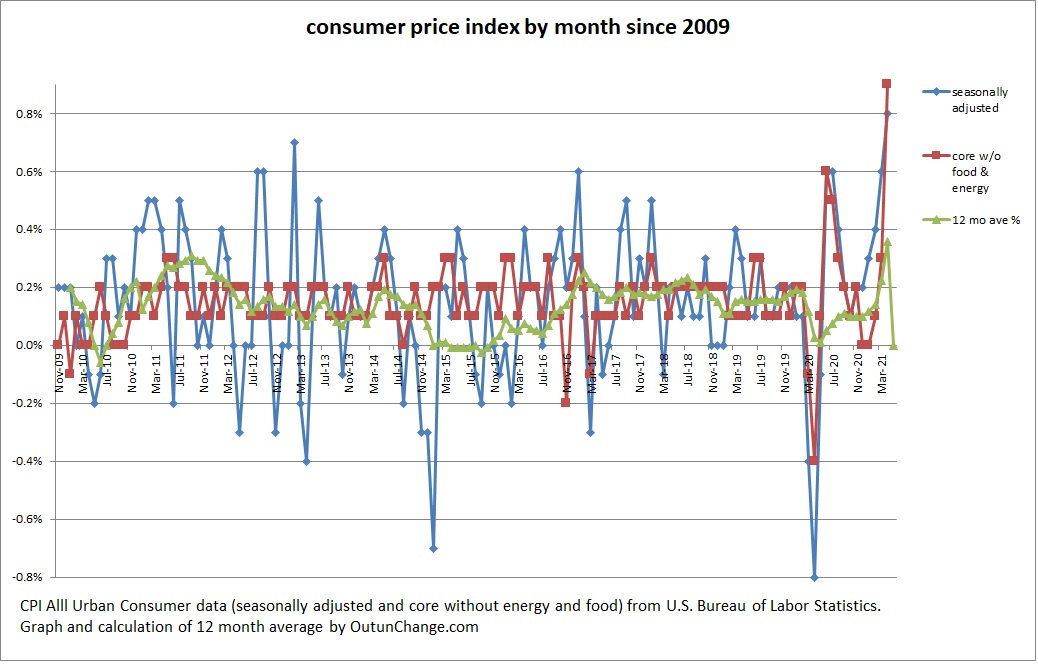
Next that’s look at the seasonally adjusted change and the inflation amount excluding food and energy. The second number there is referred to as the “core” inflation rate. I think the concept is extracting food and energy should give a smoother curve providing information on longer term trends by excluding those more volatile factors.
This is a busy chart, but studying it is useful. The three lines are basic seasonally adjusted number, monthly inflation rate without food and energy (core), and my calculation of the 12 month average.
Finally, let’s make that a little bit less busy, with looking at the data only since the start of 2019. Following graph has the same three data points: seasonally adjusted, core without food and energy, and 12 month average:
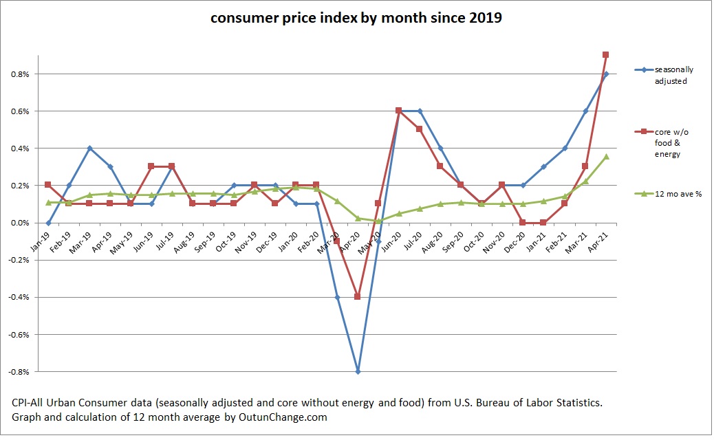
The core rate, without food and energy is particularly unsettling.