Another way to keep track of inflation trends is by watching the price index for the Personal Consumption Expenditure.
Please journey along with me as I continue my education.
In the news yesterday was the April increase which showed a 3.1% year-over-year increase compared to an expectation of a 2.9% increase. For one article discussing the news, check out the following:
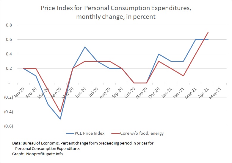
I have started to track this data, gathering information back to the start of 2020. The month by month change in the headline index and the core index (which excludes food and energy costs) can be seen in the graph at the top of this post.
Before look at the year-over-year change, we need to look at the nature of the index. There are two main indices used to monitor inflation. The first is the Consumer Price Index (CPI) which everyone knows about. The other is the Personal Consumption Expenditures (PCE).
What’s the difference? Great question.
The CNBC article mentioned above says the PCE index provides a broader measure of inflation because it is broader in scope of what data it captures and it adjusts measurements based on how consumers alter their spending patterns.
For more detailed explanation, we can look at a post from the St. Louis Federal Reserve Bank:
- 7/1/13 – Federal Reserve Bank of St. Louis – President’s Message: CPI vs. PCE Inflation: Choosing a Standard Measure
Mr. James Bullard is president and CEO of the Federal Reserve Bank of St. Louis. (I’m free to quote the article because it is a US government document and therefore is not protected by any copyright claim). Quoting him:
“Two different price indexes are popular for measuring inflation: the consumer price index (CPI) from the Bureau of Labor Statistics and the personal consumption expenditures price index (PCE) from the Bureau of Economic Analysis. Each of these is constructed for different groups of goods and services, most notably a headline (or overall) measure and a core (which excludes food and energy prices) measure. Which one gives us the actual rate of inflation that consumers face?
“On the headline vs. core issue, I prefer to focus on headline inflation, measured as the percentage change in the price index from a year ago to smooth out the fluctuations in the data. As I have discussed previously, headline measures attempt to reflect the prices that households pay for a wide variety of goods, not a subset of those goods. Headline inflation is, therefore, designed to be the best measure of inflation that we have.
“Between the two headline indexes, the CPI tends to show more inflation than the PCE. From January 1995 to May 2013, the average rate of inflation was 2.4 percent when measured by headline CPI and 2.0 percent when measured by headline PCE. Hence, after setting both indexes equal to 100 in 1995, the CPI was more than 7 percent higher than the PCE in May 2013.
“An accurate measure of inflation is important for both the U.S. federal government and the Federal Reserve’s Federal Open Market Committee (FOMC), but they focus on different measures. For example, the federal government uses the CPI to make inflation adjustments to certain kinds of benefits, such as Social Security. In contrast, the FOMC focuses on PCE inflation in its quarterly economic projections and also states its longer-run inflation goal in terms of headline PCE. The FOMC focused on CPI inflation prior to 2000 but, after extensive analysis, changed to PCE inflation for three main reasons: The expenditure weights in the PCE can change as people substitute away from some goods and services toward others, the PCE includes more comprehensive coverage of goods and services, and historical PCE data can be revised (more than for seasonal factors only).”
The PCE is broader and adjusts for changes in consumer spending patterns.
He prefers the year-over-year change to smooth out monthly fluctuations. He also prefers the headline number over a sector number.
So, let’s look at the year-over-year changes in PCE.
Since July 2020, here is the data (I can’t easily find the number before 7/20 and won’t bother looking any further.)
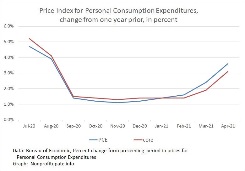
Something weird happened in 7/19 and 8/19 producing those oddly high one year changes in 7/20 and 8/20.
Changing scale of data to exclude those two odd months shows this trend.
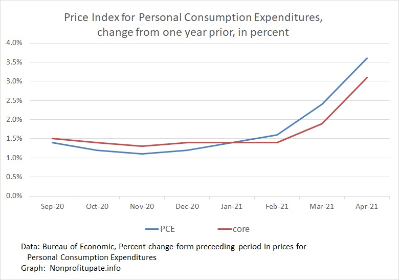
Excluding those two odd months shows a smooth year-over-year inflation rate in the PCE from 9/20 through 2/21. Also shows an unsettling rise in the last two months.
What does all that info that tell me?
Inflation is picking up in March and April.
I’ll keep watching that data. Perhaps you could too.